Black Gold Online Closed Beta Impressions
I happened to get a closed beta key for Black Gold Online from an MMORPG.com giveaway (I think) a while back. I was super excited, because I thought I was getting a Black Desert key. But alas, Black Gold is not Black Desert, so I forgot about it until I tried it out in a fit of boredom over the weekend. It seems that there is no NDA so I guess it’s safe for me to post this.
I happened to get a closed beta key for Black Gold Online from an MMORPG.com giveaway (I think) a while back. I was super excited, because I thought I was getting a Black Desert key. But alas, Black Gold is not Black Desert, so I forgot about it until I tried it out in a fit of boredom over the weekend.
It seems that there is no NDA so I guess it’s safe for me to post this.

The fantasy side of Black Gold Online.
I’ll just cut to the chase: Black Gold Online is not good. It’s one of those games designed and developed by businessmen rather than gamers. You know the kind I mean. It’s a free-to-play business model with a graphics engine attached.
It’s supposed to be a steampunk-themed game, which is cool. But there is no reason whatsoever to pay attention to anything that is happening on the screen. When you get a quest, you can click on a button that will pathfind you to the objective. (Apparently there is a setting so you don’t even have to trigger the pathfinding.) None of the mobs aggro so you can walk right through them. You kill the one mob you need to kill in two or three swings of your most basic attack. New loot is automatically equipped if it’s better so you don’t even have to look at your inventory or the stats. Then you pathfind back to the quest giver. More often than not, you gain a level. You gain like 10 levels in the first hour of gameplay. Tutorials lead you through every mouse click with mind-numbingly condescending step-by-step instructions.
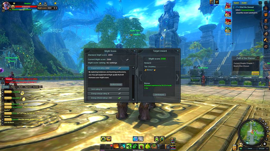
That is not the kind of gameplay that I enjoy, and the graphics are not good enough just for sight-seeing. They aren’t bad by themselves, but the UI clutters the screen with a lot of junk, and the fonts are absolutely horrible. In fact, the UI looks a bit like it was designed by someone whose credentials consist solely of making web pages for Geocities back in the 1990s. Sorry if that person is reading this. I know I would be crushed if someone said that about anything I’d done. I think if just that one thing could be improved, it would vastly change the first impression this game makes.

The Geocities Interface, complete with blinking.
Oh, and the Snail account password only accepts letters and numbers. Let that sink in. I feel compelled to point that out whenever I see a web page that does that.
On the plus side, I did not experience any bugs and the game appears to be quite finished and ready for launch. (Unless it’s a bug that none of the mobs in the first 10 levels of the game attack you.) Of the many kinds of beta you see these days, it is the “it’s basically done and it’s not going to change before release but we want to test it under some more load and if you happen to find something, that’s great” kind of beta.
So I would only recommend trying it out if you are incredibly bored, have a fast download speed, and need something to chuckle at for an hour or so. I can’t condone paying any money for it. Though I think there is room for a good Steampunk MMO in the market, this game is not it.